
YouTube’s UI refresh lets you reach a channel’s newest content faster
Summary
- YouTube’s mobile app now features an updated channel search that displays a horizontally scrollable list of recent videos directly within the search results, making it faster to see new content.
- This new UI, part of YouTube’s 2025 roadmap for improved discoverability, replaces the previous simpler channel card that required an extra tap to view recent video uploads.
- The enhanced channel card also pulls color accents from the channel’s profile picture and is currently rolling out to both iOS and Android users, potentially requiring an app update or cache clear to appear.
Earlier this year, YouTube made four big bets for 2025, highlighting a roadmap of improvements to come to the streaming platform to help it retain its spot as the “epicenter of culture.” A portion of its roadmap focused on making it easier for creators and their content to be discovered, and a new YouTube channel search tweak seems to be doing just that.
In a change that largely went unnoticed, YouTube now offers a much more ‘immediate’ channel search experience on its mobile apps.

Related
YouTube’s 2025 roadmap has four big bets, and only one focuses on AI
Machine Learning to make YouTube safer for everyone
Previously, when you looked up a channel by its name, you’d see a video from the channel right at the top, followed by their account card with their profile, subscriber count, and an option to subscribe. If you were to browse through the channel’s uploads in a meaningful manner, you’d have to manually tap the channel card, head to videos, and then use one of the sorting chips.
With the new UI, which was spotted by folks over at TechIssuesToday, searching for a channel now highlights a bigger channel card, with the latest videos from the channel laid out in a horizontally scrollable manner.
Key channel info remains visible
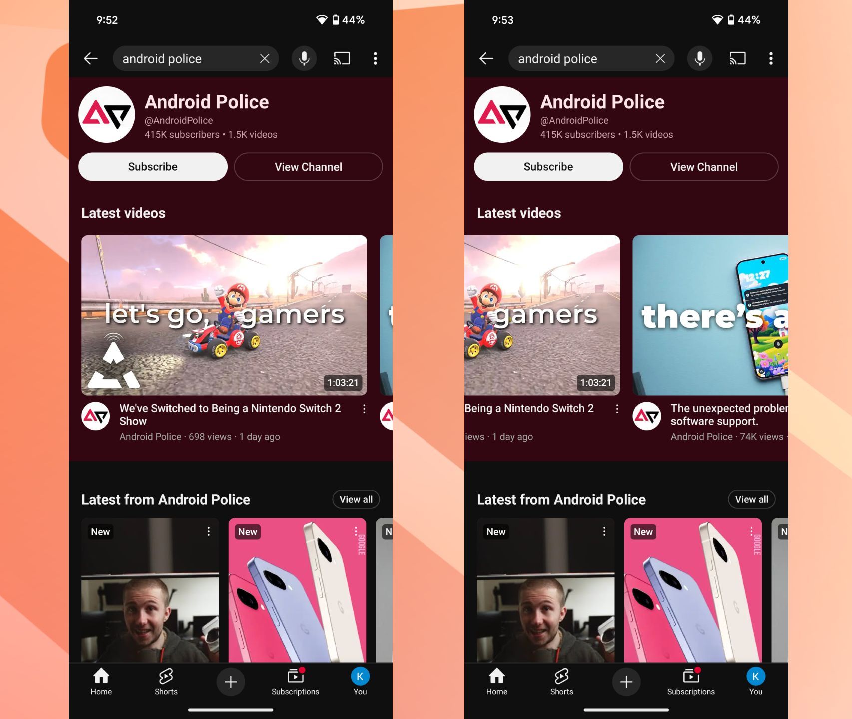
As seen in the screenshots above, the bigger card surfaces some of the recent videos we’ve uploaded to our YouTube channel in a horizontally scrollable layout, vertically followed by Shorts and other long-form videos. The bigger card surfaces in colors directly picked from the channel’s profile photo, with a slight difference in hues between light and dark mode, adding a touch of flair to the new UI.
Familiar information like channel handle, subscriber count, total video count, and buttons to Subscribe and View Channel remain put.
Placing a channel’s recent videos in a horizontally scrollable section right at the top of the search screen eliminates a few additional taps, allowing users to easily locate a desired video or browse through a channel’s recent content before deciding to dig deeper. The new UI is live for me in YouTube beta version 20.14.36, though it also seems to be rolling out in stable. Try force-restarting and clearing app cache if the UI doesn’t surface for you post-updating.

1