Google Messages UI tweaks keep coming

Summary
- Following recent tweaks to read receipts, search, and message bubbles, new changes are being tested, including a dynamic dark send button, larger avatars for unread messages, and a shift from a heart to a thumbs-up default double-tap reaction.
- Google is focusing on enhancing visual feedback, with changes like the darkening send button and dynamic avatar sizing aiming to improve accessibility and message prioritization.
- It is currently unclear if and when these changes will become available widely.
Google Messages is showing no signs of slowing down its iterative UI upgrades, with at least three new changes now beginning to appear after a flurry of tweaks in recent weeks.
For those unaware, in the past few weeks alone, Google has been spotted tweaking Google Messages’ read receipts and search interface, alongside facelifts for the way message bubbles appear within chat windows. Additionally, to complement the updated search interface, the tech giant is also looking to redesign the ‘Start chat‘ menu, with a WhatsApp-like message detail screen also reportedly in the making.
Related
The ‘Start chat’ menu in Google Messages could soon receive a modern facelift
Rounded elements are taking over
Some of those changes are yet to hit the stable channel, and Google is already testing out changes to the app’s send button, avatar/profile photo display, and even the default double-tap reaction.
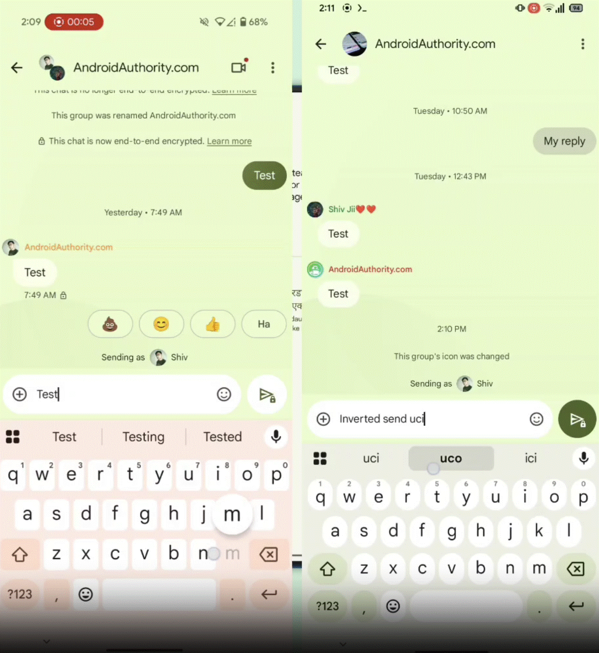
As highlighted by Android Authority, Google Messages’ send button appears to be undergoing a dynamic revamp, shifting to a darker color Material You color (depending on your theme) as users begin typing. It’s not a major change, but one that can easily be identified by someone who uses Google Messages as their daily messaging driver.
The subtle change should allow for better visual feedback when typing, also improving accessibility for users with visual impairments. For what it’s worth, I’m not seeing the change on the latest stable and beta Google Messages builds. If and when this rolls out is currently uncertain.
Elsewhere, the messaging platform might also be working on a visual change to help users distinguish unread messages from read ones.
Those wonky profile picture frames might be intended
Spotted by Reddit user Affectionate_Mall_53 in a new Google Messages build, the tech giant might be testing dynamic chat list profile pictures/avatars that appear larger than regular when a message from that sender is unread. This does have the potential to make unread messages stand out more than the current bold text implementation, though I could also see this being an annoyance for those who prefer a more uniform and less distracting interface.
Lastly, Google also seems to be changing the app’s default double-tap reaction. Currently, double-tapping a message allows users to react with a heart emoji. With the app’s potential change, as shared by several users on Reddit, the gesture might soon default to a thumbs-up reaction. Naturally, this begs the question: will we ever get custom double-tap reactions?


4